


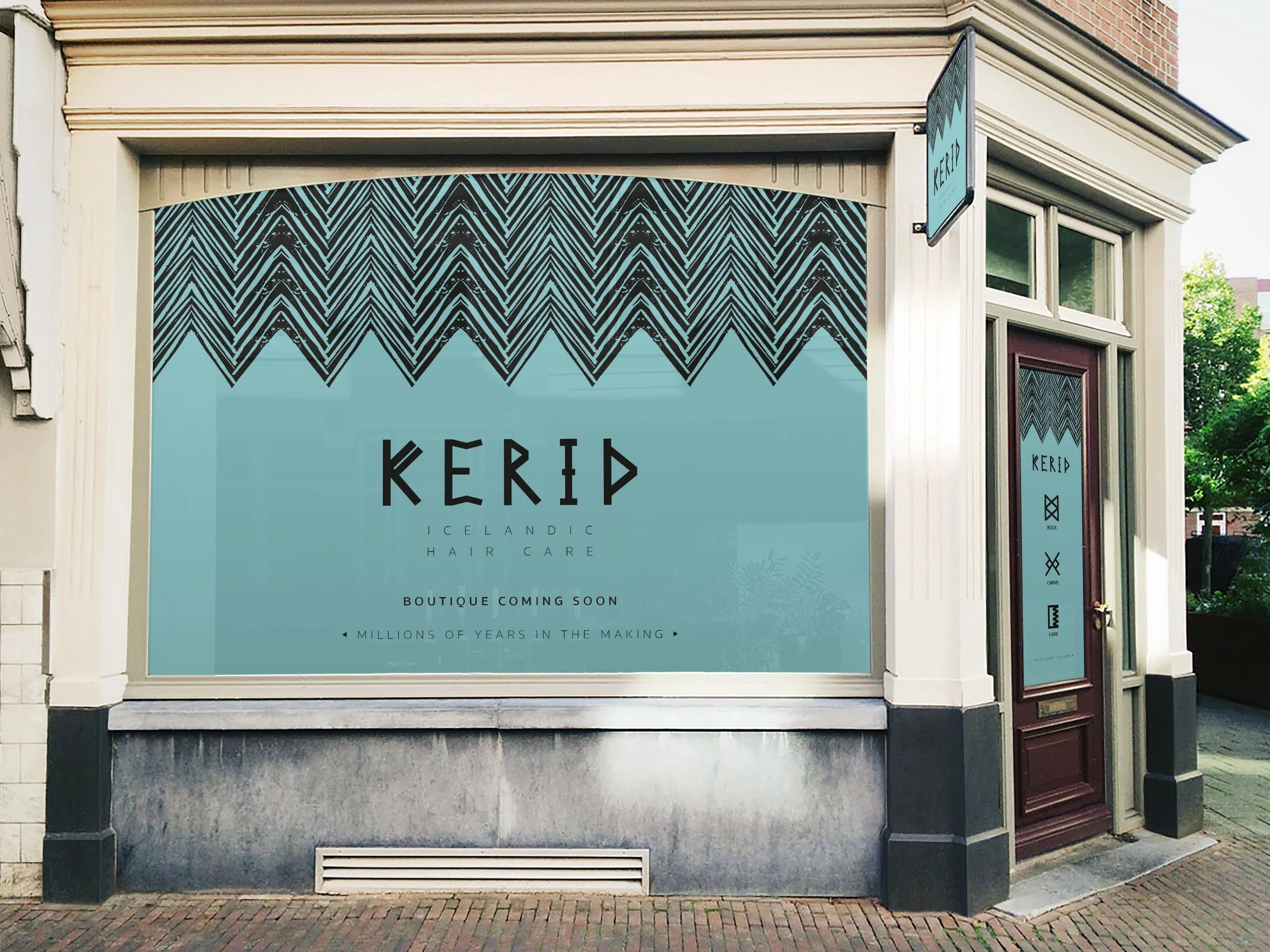

Given a simple comb and tasked with creating boutique packaging for a niche consumer; a target market of 20s - 30s females with an interest in design. Named 'Kerid' after a famous volcanic crater in Southern Iceland the comb packaging plays on the handcrafted feel of traditional Icelandic art and craft. To achieve this I created a bespoke lino print with an abstract 'volcano' pattern and also designed my own typeface for the 'Kerid' logo itself. The reverse of the packaging includes icons that are reminiscent of Icelandic runes.