
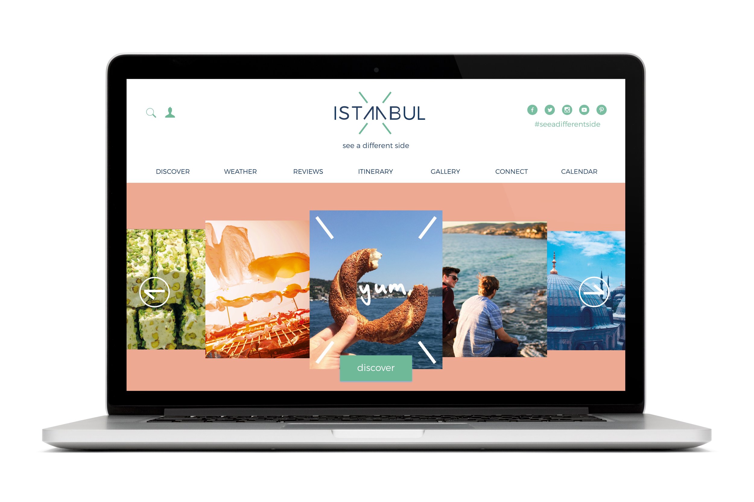
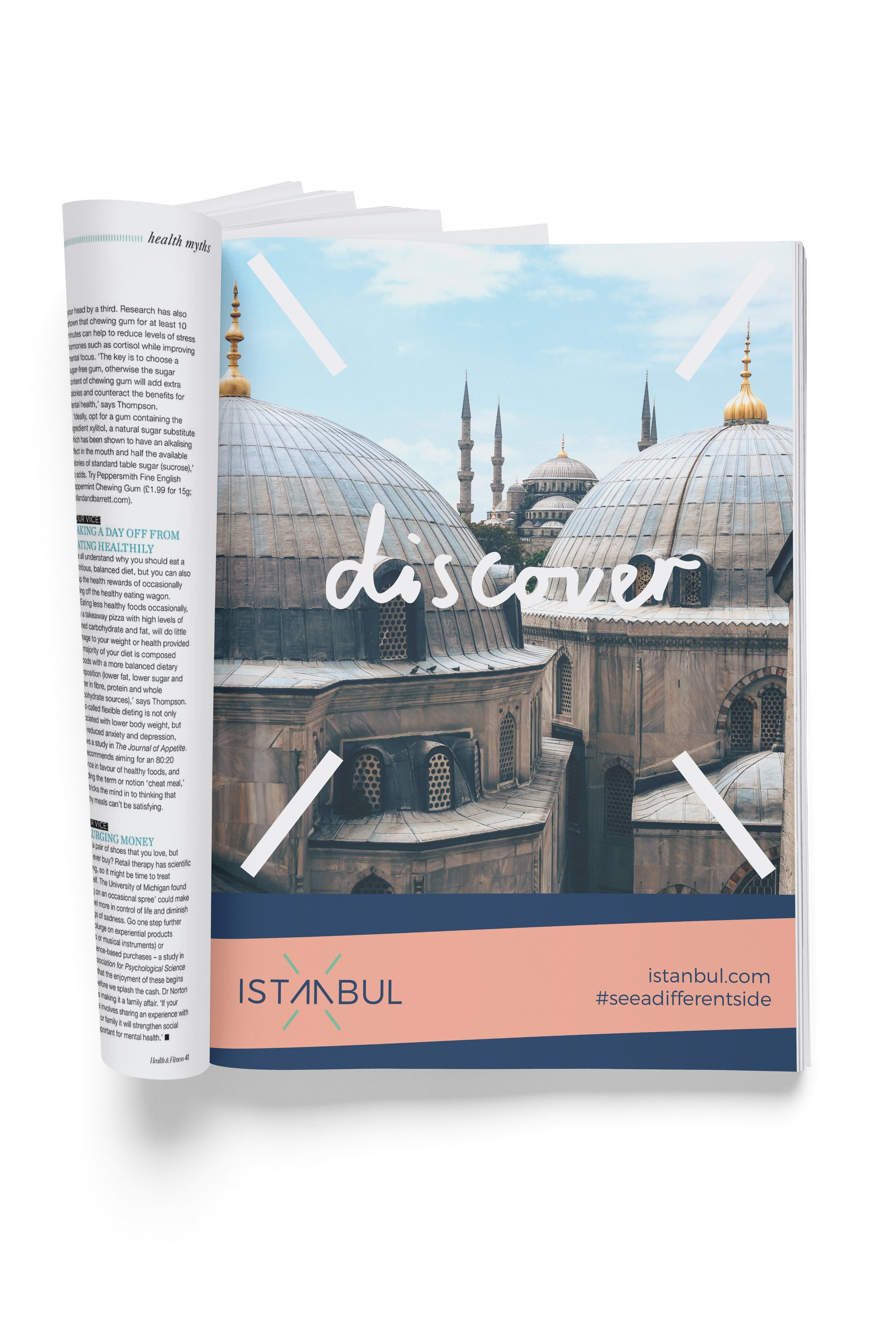

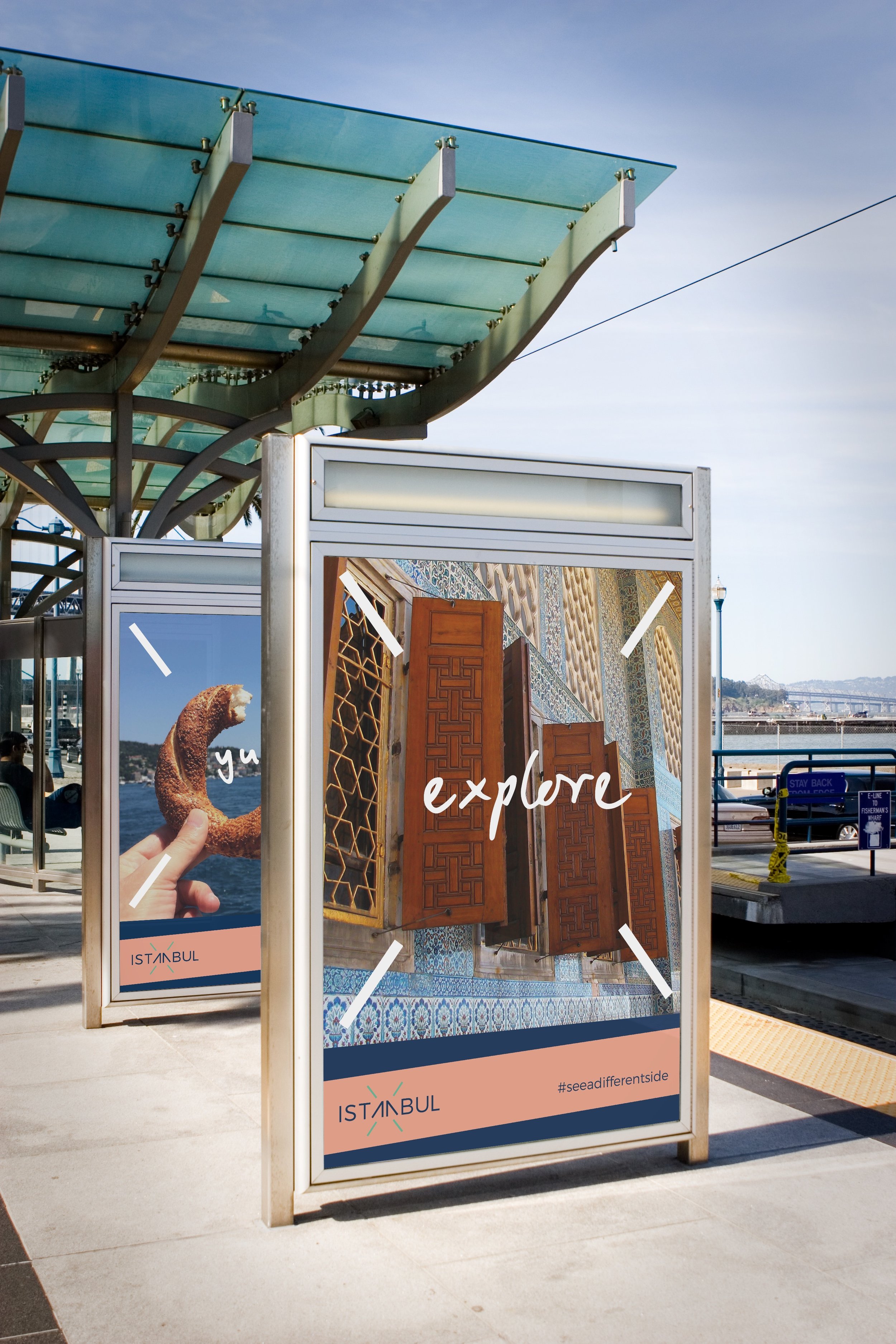

Branding - Istanbul
Tasked with re-branding the city identity of Istanbul, I explored the idea of the connection of people, and exchange of ideas, across two continents. For the logo design I knew I wanted to create something that felt contemporary but retained some element of heritage and tradition. To achieve this I selected and customised a clean sans serif font yet selected my colour palette from the pattern of a traditional turkish tile. The tag line ‘see a different side’ references both the physical 'two sides' of Istanbul but it also encourages the tourist to seek out something new.